Unlocking segmented user data for a “publisher in a box” CRM experience
MY ROLE INDIVIDUAL CONTRIBUTOR

Project Details
The editorial team at The Baffler approached Postlight to help with a CRM platform they had been developing for internal use. ARGO is a backend publishing database designed to aggregate a magazine’s online and offline interactions with web visitors, print subscribers, donors, event attendees, friends at other publications, and even newsstand distributors.
please note: due to Covid-19, some process is missing from this case study due to it’s location
Problem
Managing a small to medium independent magazine is extremely challenging because the traditional publishing business model is rapidly splintering. While magazines still have substantial audiences (particularly on the web!), subscription and advertising revenue are no longer sufficient to keep the lights on. With ARGO, the Baffler was looking to unlock the data around segmented users and offer up a software program that would highlight the business impact of publishing decisions.

Challenges + Process
There were some challenges from the onset to try and reconcile. The first was a three-month timeline to deliver the CRM to the client. The second, which made the first challenge that much more pressing, was the fact that both my engineering partner and I realized early on that it would be more complicated to fix the platform as was, so made the decision to rehaul both the front and back ends of the CRM experience from scratch.
This meant that we had to make some compromises along the way in terms of decision making. Knowing that the client intended to take what we gave them and build upon it, we decided to prioritize making sure features had a strong enough foundation for an MVP version for the client to build upon versus long term use cases.
previous platform design example
ROADMAP + WAYS OF WORKING
The first order of business was creating a roadmap of what features we needed to include and scope the length of time. Working closely with my developer, I created a sprint schedule that would reflect both design and development efforts.
Secondly, my engineering partner and I discussed ways of working and areas where we could shorthand discussion around specs, interactions and UX expectations. Because the client had identified Material Design as a preferred direction, we decided to leverage the Vuetify Material Design Component Framework as a source of truth between design and development.

WRANGLING DATA INTO MODELS
The main goal of the ARGO software was to be able to bring in data from a variety of different APIs into one platform. The goal was to create a user-friendly experience of aggregated data from sources such as Mailchimp, Eventbrite, Quickbooks, Adobe Sign, Shopify, Wordpress, and their subscription house Fulco...just to name a few. What helped with mapping these needs into the front-end was a document created and shared by my engineering partner. He created a sheet of models that I could use as a reference when designing. By leveraging these models, I was able to sketch out data logic flows to not only understand how and where a user would need to access the data, but also how the data was connected to other data points and how that aggregated data would then render out in the front end.

BUILDING BLOCKS
When the Baffler approached our team, they had already spent two years developing the software but felt that what they had developed was at risk of not fully realizing the intended functionality. One of the main points of concern for them was the look and feel of the design. By their admission, the design up to that point had “received very little love,” as they had chosen to prioritize the functionality of the site over the UI. They were open to exploring different directions but had the following criteria:
wanted it to work with the newly redesigned logo
wanted the design language to be modern, approachable, precise, and straight forward
were really interested in incorporating elements of Google’s Material Design language.
Once I had all my building blocks in place (timeline, goals, component library, data models and maps, etc.) it came down to pulling components from the Material design library to create designs. Because of the timeline, the decision was made early on to skip the wireframe phase in the product cycle and build using UI. Working directly out of the Material Component Sketch library plugin, I would then cross-reference a selected component with the Vuetify Component Library to not only be defining the UI along the way but the interaction pattern as well.
The video, I discuss the approach to design process in a more detail.
DESIGN
CONTACTS/PEOPLE
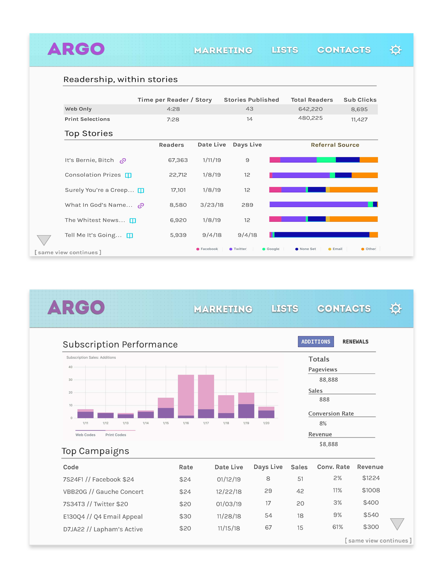
The first thing I wanted to tackle was the Contacts/People page. This page was one of the most complicated because it was one of the main sections of the CMS which would aggregate data from multiple sources. Because it would take a lot of components to define the front end, my strategy was to tackle this first to be able to define as much as I could in the UI/UX patterns that could then be repeated throughout the rest of the design. By taking this approach, and leveraging a module system, I was able to define multiple UI components that were repeated throughout the rest of the designs.
The way that the individual contact page was conceived, was that if any API had data on the individual, then it would activate the specific module to appear with the captured record. All these individual contacts and their data would be served into an aggregated list view for users to select and build lists from.
By tackling the UX and visual interface of this page, I was able to define the UI for multiple components which could then be repeated throughout the rest of the designs.

aggregate contact page view

individual contact page, collapsed

individual contact page, expanded, all modules
FILTERING
Because there was an incredible amount of data to aggregate, filtering was always going to be a key feature for the ARGO CRM platform. The key thing was for me to map out all the different data journeys depending on which selections a user could possibly make. I began this process by first simply sketching out the paths, but then quickly moved into the UI to begin to define components. In the first iteration, a choice a sidebar filter and proceeded to design out all the use cases and components that would be needed. After this, it was abundantly clear that the functionality needed was to complex to relegate to a sidebar. So then in the next iteration, I decided to approach the problem by creating a more focused experience, expanding the filter and defining a space where a user could decide what parameters they would want in their search.

sketches of data journeys

filter, v1

UI of every filter state

DESIGN SYSTEM
Leveraging Material Design and Vuetify component libraries also helped us to be able to hand over a complete design system at the end of the project

design system
Outcome
Up against a ticking clock and a complicated problem, I feel like this project served as a testament to when design and development truly can find common languages to work agile together. Our goal was to build the best MVP version we could to hand off to the client which would allow them to use it and evolve the platform themselves.
Development John Holdun
Additional Design Matt Vaccaro (Forecaster)
Project Manager Matt Perlé
